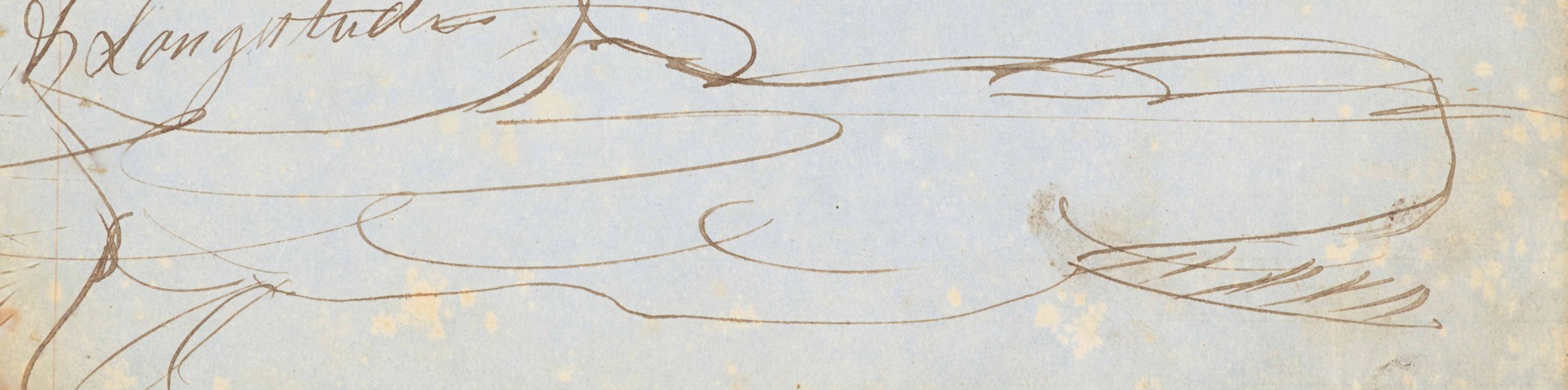
How do I create such amazing, eye-catching exhibits? Through pure genius.
Let me walk you through it. In July, we knew we needed to fill 12 wall cases and four table cases. Two wall and three table cases were already spoken for by Lynda. And the Boatwright/WLC Reopening Celebration served as a good deadline to sharpen the mind. Thinking of the start of classes got me to “school days, school days, good ol’ golden rule days.” Reading, writing and arithmetic took care of three of the cases. I decided to omit “taught to the tune of a hickory stick” since corporal punishment is generally frowned upon in education these days.
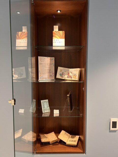
The Odyssey was also a no-brainer for this summer.
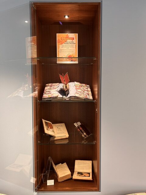
The next step is finding items to fit the theme. Sometimes I do it the other way around. A cool/interesting/new/nifty item on our collections might spark an idea. But this time, the theme came first. The easiest way to start finding items was to use the Rare Books tab in One Search. My first three searches used the words “reading,” “writing,” and “arithmetic.” I focused on books that had the words in the title, in order to make the theme more obvious. Then it’s just pulling a bunch of books and taking a look. Does the book have that old book look to it? Or is it a boring newer rebinding? Are there interesting illustrations? The survivors of this round then move on to the exhibit mock-up. Based on a mental image of the exhibit I’ll lay the books out on a table to see how they play together, a sort of rough draft. This further winnows down the items. I’ve learned that with these exhibit cases, and exhibits in general, less is more.
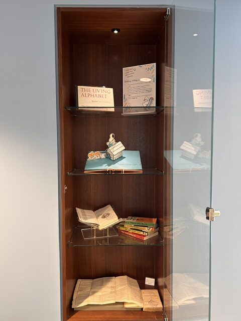
After initial layout and figuring what book supports are needed, it’s time for initial installation. Sometimes things just don’t work or don’t fit in the cases. Luckily, the shelves are adjustable, which came in handy when I needed to make room for the SLS rocket model I used in the Artemis II exhibit in Spring of 2026. Also tricky is that each of the wall cases has a single light at the top, so we often have to adjust things to compensate for shadows.
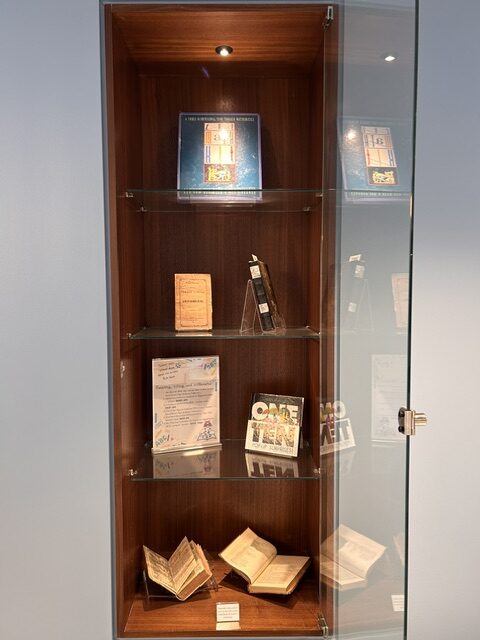
After that, it’s time for the signs. Again, less is more. No one is going to stand around reading a super long exposition, especially when they have a phone in their pocket to distract them. I try to stick with title, brief explanation or subtitle, followed by the items on display. I might give a little context for the less obvious exhibits, like my Political Figures of Ireland exhibit from March & April of 2026. I tend to lean into plain text on a plain background, which is, admittedly, boring. I rely on my colleague, Natalie, for creative signs, since graphic design is her passion. The point of the displays, well, the point of my displays, is to show off items from our Archives and Rare Book collections, have fun and maybe catch someone’s interest enough that they’ll come find us.
What’s your favorite exhibit?